Wednesday, November 10, 2010

Cat in Purple

I love this picture of my sister's cat. All I did was give it a black and white filter, then add a mask to keep the color of the harness. I also masked in a little color for the paws.

Adorable.

Wednesday, November 3, 2010

Firework

Trying to use a design tutorial based on something totally different (but in Photoshop), I ended up with this smokey apparition. It's my cat -- again :)

Wednesday, October 27, 2010

Blue Box

Made in Photoshop just using a couple Black&White filters to preserve the blue.


This is somewhere in New York, I think. There is no snow, it's summer, but it looks a little frosty, which is appropriate since right now I'm gazing outside at a winter wonderland.

Friday, October 15, 2010

Hopping (click me)

Instrumental piece I'm working on. This is after step 1, it's not done yet.
...But I'm inexperienced in mixing music so this may be the best it gets!

Friday, October 8, 2010

Beach

Original, looks rather grey and dull:

Modified, bright:

Wednesday, October 6, 2010

Amazing Simple Adjustments

Original image of cat:


Settings applied:

Enhanced image of cat:

I colored her eyes, too, that's the invisible hue/saturation mask, but it looked weird.

Nothing special!

Except that she's cute and it's a great picture :)

Monday, October 4, 2010

Trek the Mountains

Using similar methods to Ch.1 of this lynda.com Photoshop CS3 training course, I created this composite of a suspension bridge and Mt. Everest at sunset. (The gold is natural!)

I can't get the bridge to look as though it belongs there, I don't have that skill, but it was pretty fun to play around.

Here is the original one-on-top-of-the-other image:
And here is a later rendition:

It's amazing to see the changes in the images. All it took was Brightness/Contrast, Hue/Saturation, and Levels adjustments and adjustment layers, a gradient for the sky, some burn and dodge, unsharpen mask, and text with outer glow (low fill opacity) and a layer mask.

When you consider I have really no idea what I'm doing, it's pretty cool.

Monday, September 13, 2010

EarthSpray


In Photoshop.

Wednesday, September 8, 2010

Earth Splat

Splat. (with Photoshop.)

Tuesday, September 7, 2010

Neon Logo

Using an Abduzeedo tutorial. (Photoshop, using Illustrator for the text and pasting in Photoshop as a smart object.)
v2 with a more solid color snake in the background. Which do you like better?

Friday, September 3, 2010

Dragon Smoke

How do you like my dragon?


Made in Photoshop, playing with new brushes.

Wednesday, September 1, 2010

Dot Spiral

With Photoshop.

Monday, August 30, 2010

Dotfall

Playing with brushes in Photoshop, I created this colorful splotch of falling dots.

Friday, August 27, 2010

Dark Nautical

It's rather hard to see the wheels in the back.
I like the shades on this image but it's only a background picture.
Created in Photoshop while playing with brushes.

Wednesday, August 25, 2010

Watching the Beast (v2)

Click the title to sample my second recording of Watching the Beast. It's a little different feel, and it's longer with instrumental intro and outros. I think I like the way I sang the first version better, but there was a lot of feeling in this one. Does it come through to you? 

Friday, August 20, 2010

Let it Go

In Photoshop, playing with brushes.

Thursday, August 19, 2010

Chikara ga Aru

Made in photoshop with smokey brushes.
I have the power.

Friday, August 13, 2010

Once Upon A Time

A quick experiment with textures.
I can't figure out how to add a texture to Photoshop, but it works fine if I just copy the texture image into my project and set the layer mode to 'Screen'. That's what I did here.

Wednesday, August 11, 2010

Clash of the Kittens Part 2

Same tutorial as the previous post, 4 more variations.


Monday, August 9, 2010

Clash of the Kittens

I created some awesome kitty clashes based on this abduzeedo tutorial.

Here are my first 3 variations. Which do you like best?


p.s. It took me maybe 2 hours total to do the tutorial, mostly 'cause I wanted to make my own clippings.
So the images include only my own pictures etc., except for the text texture, which I got from the wikimedia commons. The flare was created through many manipulations and distortions of a picture of the sun. The cats are all mine :)
Enjoy the Clash of the Kittens!

Friday, July 16, 2010

Watching the Beast (click me)

Click the title to hear my latest musical composition. Created and recorded in 1 day.
Beauty and the Beast based :)

Wednesday, May 26, 2010

Aquarium High

A logo I created for a fake high school logo in a demonstration.
Probably in Graphic Converter.

Thursday, May 13, 2010

More mountain variations

Here are a couple more variations:

Tuesday, May 11, 2010

Variations on Trek picture

Here is the original picture, taken by my father in Nepal 2007 on the way to the Everest base camp.

Here is the first variation in Photoshop:

Thursday, May 6, 2010

Other renderings of 3D text

I played with some effects to get these...

Tuesday, May 4, 2010

I'm Not Wrong (click me)

Finally I gave in and decided to upload an audio file. I just made this up today and recorded it with my laptop mic. This is try 2, which is good enough, though I messed up a couple times.

Friday, April 16, 2010

Time to Rise (to the stars)

I created these images from this Abduzeedo tutorial, with a couple of my own modifications (i.e. didn't notice my brush opacity was set to 33%, hehehe. Also, created my own eclipse image.) The only reason I didn't use their text (Lost in Space, which was cool) was... was... well, I try to add a little originality :)
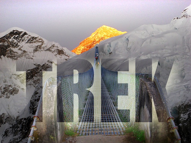
(I wanted to do Time for the Stars but it didn't fit very well.)

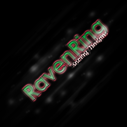
First, the end result, just the text.


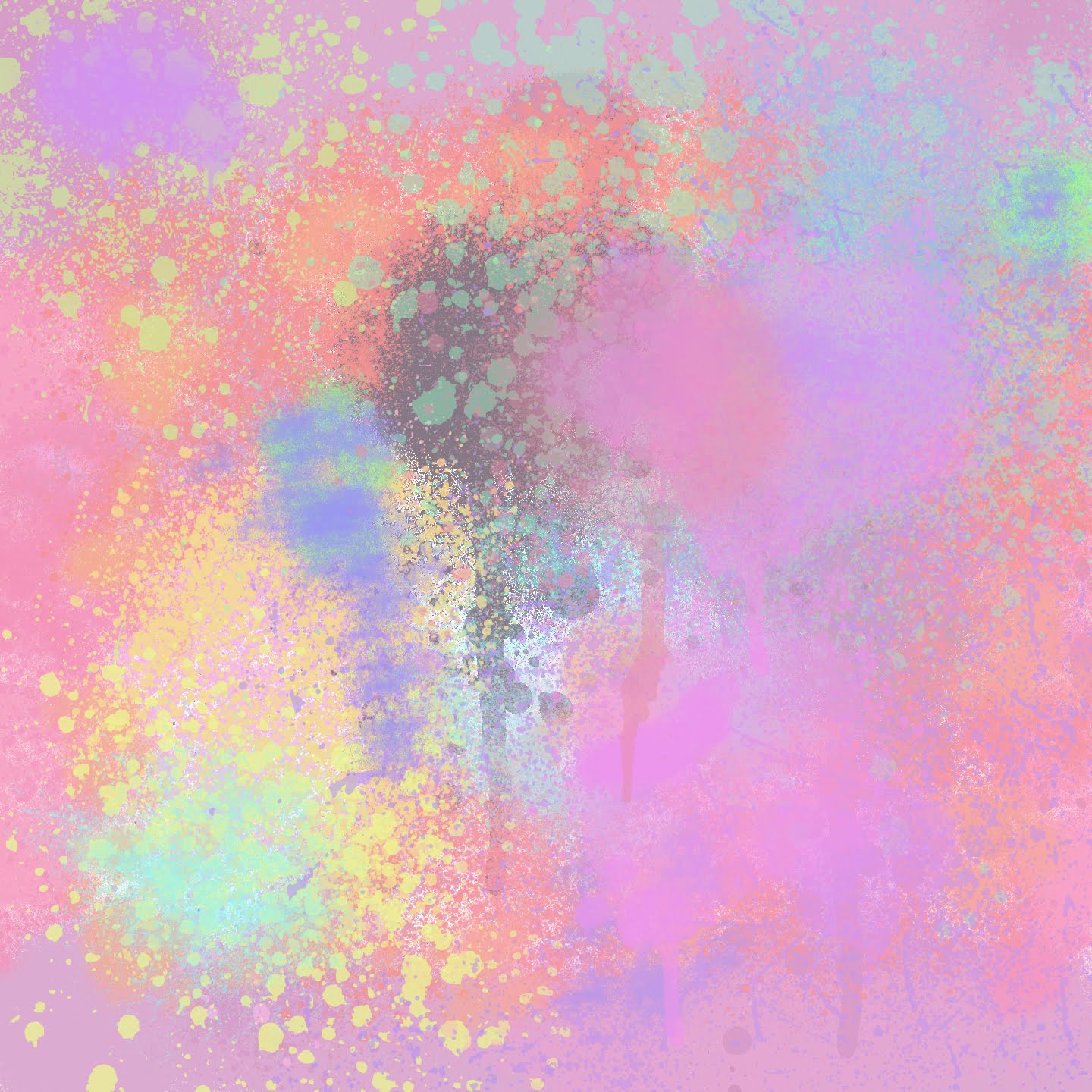
Next, the text over the background, because I like the background, it was fun.


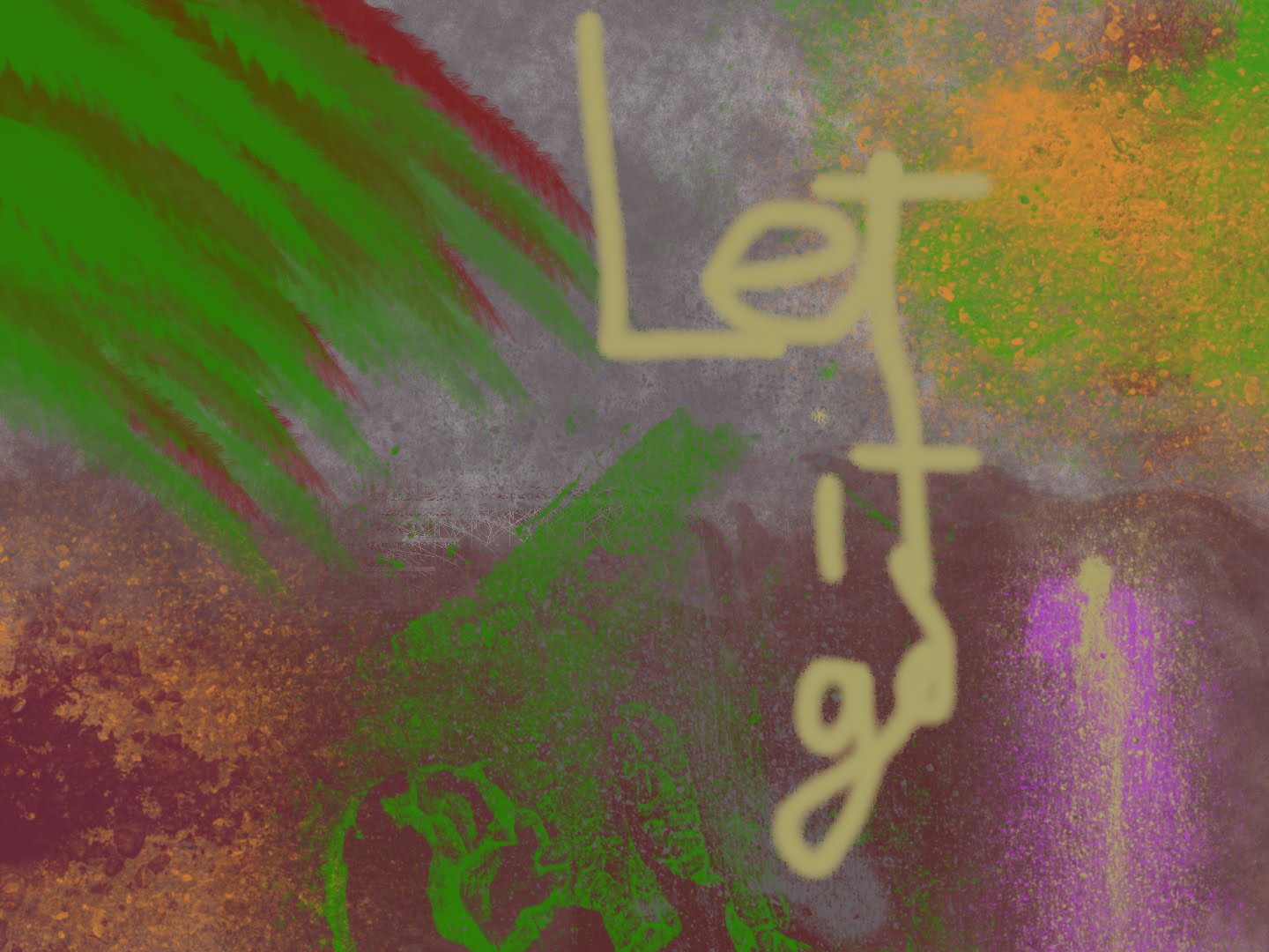
A variation with shifted text.  (hardly noticeable)

It was a great tutorial, and easy to understand, especially because of the screen shots that allowed you to copy the settings without confusion. Of course my inexperience and lack of Photoshop knowledge and other random elements means it didn't turn out looking nearly as cool as the tutorial's, but I had fun, learned a lot, and it looks pretty neat. Thanks to Abduzeedo!

Thursday, April 15, 2010

Music clip (click me)

I created this music clip to use in a closing sequence (credits). 15 seconds of original Garageband-edited tunes (but the percussion is one of Apple's looping tracks). I think it turned out pretty well, I'm rather proud of myself :)

Wednesday, April 14, 2010

3D Logo, Fun Text Stuff

From a tutorial at this link psd.tutsplus.com.
 Use your Magic Eye skills to see it in 3D.

 It was fun to do the tutorial because I love creating fun stuff and learning more about Photoshop, but the tutorial wasn't that great. I don't know if it's because I'm a Photoshop newbie (<- the likely cause), or because the instructions were for CS2 and I have CS3, but sometimes I found the steps too unspecific, and I had to make other changes to have it come out looking right. But it was fun!

Tuesday, April 13, 2010

Ribbon

I did this based on a Logo Design Process, found here, blog.spoongraphics.co.uk

I couldn't figure out how to do all the stuff he mentioned in Illustrator, so after creating a few beautiful ribbon outlines I gave up and created segments in order to get a colored version.


It was a lot of fun, though frustrating. I can work the gradient tool now, but honestly, it should be so much easier. I had to refer to this page at en.allexperts.com each time because I forgot.

Playing with the burn tool to darken the edges was fun.

Thursday, April 8, 2010

Pastel Sweep and Rise (For Easter)

Playing with brushes.

An Easter touch.